 Sergey Leschev

Responsive Email Design
Swift (L6+) | Full Stack (L6+) | Design Patterns (L6+) | System Architect (L7+) | Blog
Google Engineering Level: L6+
Design large-scale systems / 2022
🏆 Awards
Ranking #Dev: Global TOP 200 (Certificate)

Languages: Swift, TypeScript, Shell, Database (T-SQL, PL/SQL, MySQL), Concurrency (Python3).
Algorithms: linked lists, binary search, hash table, queue/stack, dfs/bfs, sort, heap/hash, two pointers, sliding window, tree, greedy problems etc.
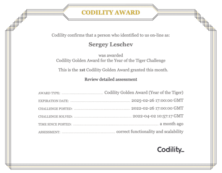
Golden Award for the Year of the Tiger Challenge
Algorithmic skills: Dynamic programming, Greedy algorithms, Catepillar method, Binary search algorithm, Fibonacci numbers, Euclidean algorithm, Sieve of Eratosthenes, Prime and composite numbers, Maximum slice problem, Stack and Queues, Sorting, Time Complexity, Arrays, Prefix Sums, Leader, etc.
Contest: Algorithms, SQL, Data Structures, Bitwise operations (bit-ops), Frontend.
🐝 Which mobile devices can you design for
A quick caveat: The techniques listed here aren’t universally supported by all mobile email clients. As you may know, not all email clients were made equal—even on the same device, how an HTML email displays can vary radically from inbox to inbox.
Thankfully, the iPhone and other Apple iOS devices can not only boast of near trouble-free email rendering, but also account for a large percentage of mobile email opens, too. However, with the latest release of iOS 13, Apple’s dark mode will pose new design and coding challenges to overcome so always remember to test your emails.
With this in mind, we present to you a non-exhaustive list of mobile email clients and their support for media queries. For context, media query support enables you to use many of the responsive techniques that we’ll be covering in this guide.
Default device email clients
| Client | Media query support |
|---|---|
| Amazon Kindle Fire | Yes |
| Amazon Kindle Fire HD | Yes |
| Android 2.1 Eclair | No |
| Android 4.x native client | Yes |
| Apple iOS | Yes |
| Gmail App for Android | Yes |
| Gmail App for iOS | Yes |
| Yahoo Android and iOS | Yes |
| Outlook Android and iOS | Yes |
| Gmail Android IMAP | No |
| Microsoft Windows Phone 7.5 | Yes |
| Microsoft Windows Phone 8 | No |
| Microsoft Surface | No |
| Windows Mail | Yes |
| Samsung Email 6x | No |
3rd-party email clients
| Client | Media query support |
|---|---|
| Microsoft Outlook Exchange third-party app (Android) | No |
| Gmail mobile app (all platforms). There are limitations: see supported CSS properties | Yes |
| Yahoo! Mail mobile app (all platforms) | No |
👫 Design techniques for mobile optimization
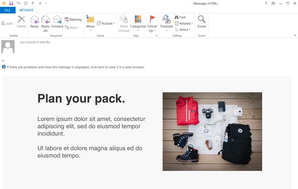
We’ll be designing two CSS layouts of the same newsletter: one layout that looks great in webmail and desktop clients, and another layout that can be easily read on the smaller mobile device screens.
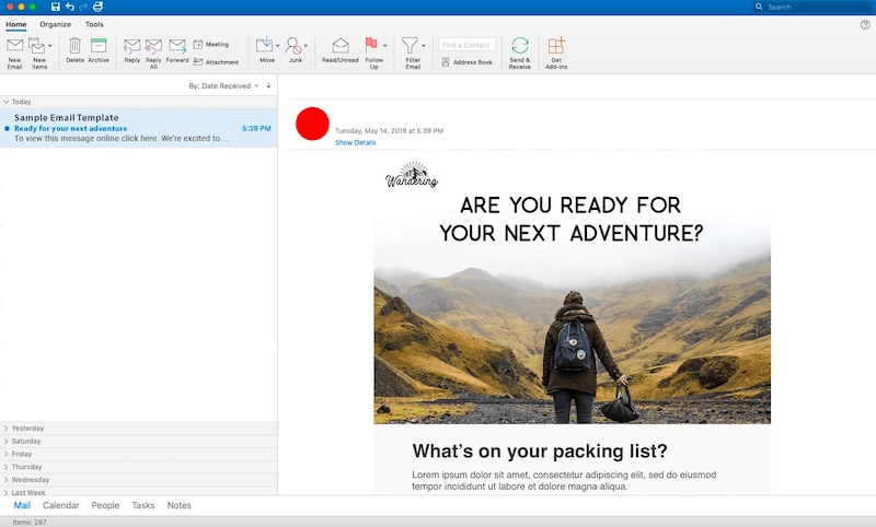
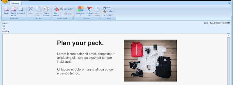
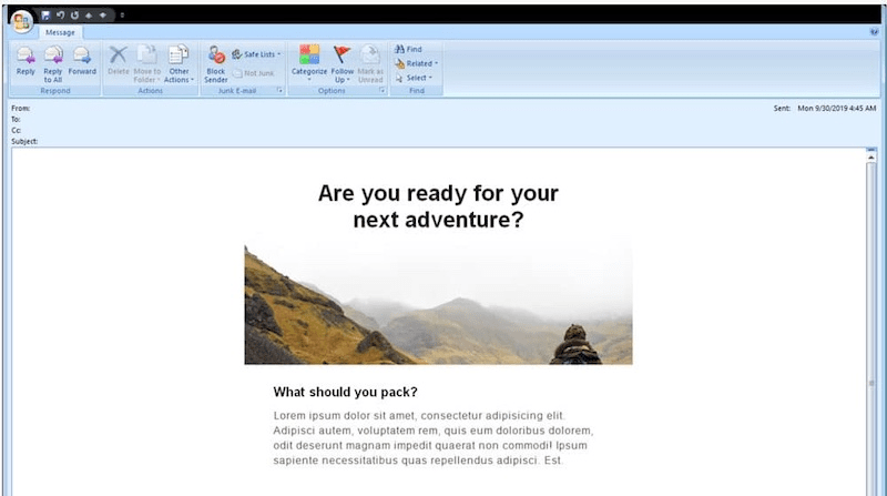
For example, here’s an HTML email in Outlook:
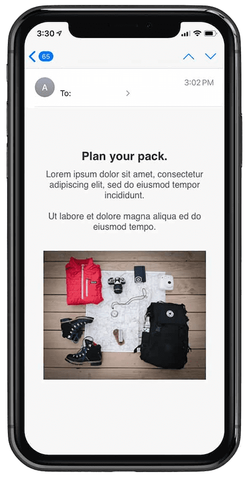
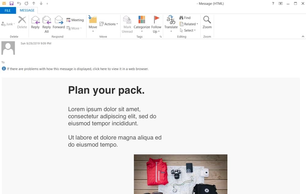
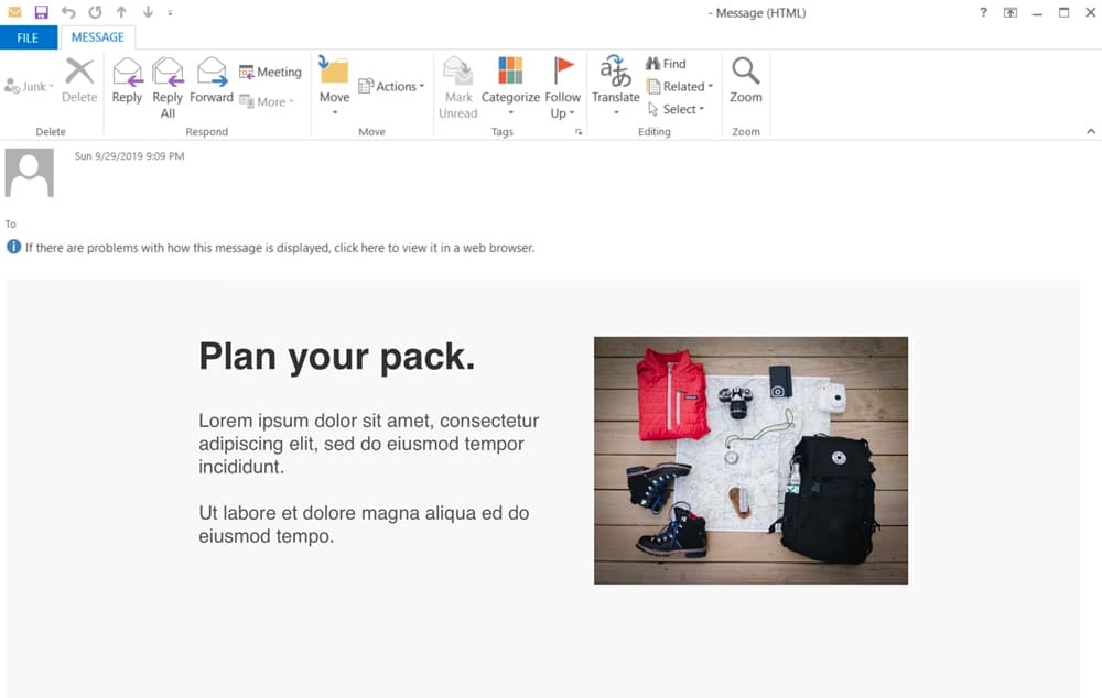
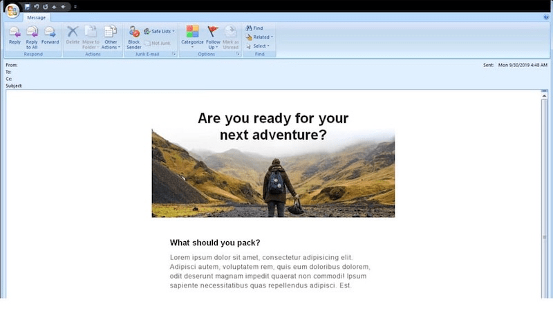
Below is the same email, only this time viewed in Apple’s iPhone Mail. As you can see, there are significant differences between the two layouts. The mobile version is skinnier, lacks visual clutter, and is just as readable as the desktop version. This can be attributed to the use of mobile-specific CSS:
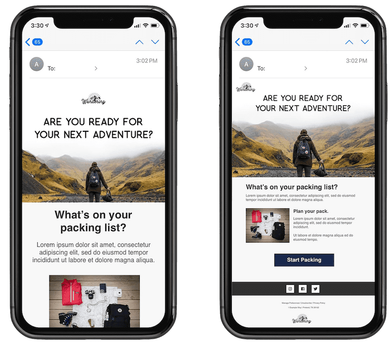
As a point of comparison, the right image is the same email, without this stylesheet. See how tiny and unreadable the text is? This is the problem that faces millions of email newsletters received on mobile devices every day.
Mobile-friendly layouts and design elements
Designing for mobile isn’t simply a matter of taking a crack at writing mobile-specific CSS. Here are some other considerations:
-
Single-column layouts that are no wider than 600 to 640 pixels work best on mobile devices. They’re easier to read, and if they fall apart, they’ll do so more gracefully.
-
Links and buttons should have a minimum target area of 44 × 44 pixels, as per Apple guidelines. Nothing is more unusable than clouds of tiny links on touchscreen devices.
-
The minimum font size displayed on iPhones is 13 pixels. Keep this in mind when styling text, because anything smaller will be upscaled and could break your layout. Alternately, you can override this behavior in your style sheet—do so with care.
-
Remember to keep your message concise, and place all important design elements in the upper portion of the email if possible. However, since screen sizes have become larger and there’s more real estate than ever before, it’s recommended that you explore and test various formats (e.g. long-form content vs. short-form content). Always keep your brand in mind. What might work for one brand may not work for yours.
-
When appropriate, you can use mobilehide{ display: none !important;} to hide content in your mobile layout. Use caution when hiding content in mobile. Ask yourself, if your content is not worth showing in mobile, should it be included in your desktop version? If you find your design uses this class on several elements, you may want to reconsider your design and content.
When mocking up an HTML email or template, our advice is to create three sketches or wireframes: one of the desktop and webmail layout, one for the tablet layout, and one for a mobile layout. Building these three layouts will allow you to see how your content will break on various devices, and it will help determine what media queries you’ll need.
📧 Coding mobile emails
When web designers or developers talk about stylesheets or CSS (Cascading Style Sheets, they’re usually referring to an external stylesheet. And while that works for websites it’s not the best for email.
Several major email clients block external stylesheets we included our CSS in two ways:
-
Embedded styles located in the “head” of an email contained in a style tag
-
Inline styles included in the body of your email
When coding a mobile-responsive email, you’ll need both, as some clients will remove the embedded CSS in the “head” of your HTML document, so the inline style ensures your emails look perfect no matter what device your subscriber is using.
Here’s what a basic stylesheet using both embedded and inline styles looks like:
Embedded styles

<head>
<style type="text/css">
    /* regular CSS styles go here */

    @media only screen and (max-device-width: 640px) {
        /* tablet-larger phone CSS styles go here */
    }

    @media only screen and (max-device-width: 479px) {
        /* smaller-mobile-specific CSS styles go here */
    }
</style>
</head>


Inline styles
<table width="640" border="0" cellpadding="0" cellspacing="0">
<tr>
<td>
<table width="320" border="0" cellspacing="0" cellpadding="20" align="left" >
<tr>
<td width="320" style="font-family: Helvetica, Arial, 'sans-serif'; font-size: 33px; color:#1B1B1B; padding-left: 30px; padding-right: 30px; font-weight: 500; line-height: 40px; letter-spacing:.5px; width: 600px;">Content Example</td>
</tr>
</table>
Embedded styles are what help you create mobile-responsive layouts. In the example above, an @media declaration is made following mobile-specific CSS styles.
Let’s examine what this declaration does: @media only screen specifies that the email has to be displayed on a screen, and the second part, max-device-width states the device’s viewport requirements.
The examples above states that the viewport can have a maximum width of 640px and 479px, and then the styles following are implemented into your email, adjusting everything from image and text sizes to the overall layout of your email. Including two breakpoints can help you tweak various elements in your email to accommodate larger mobile displays, such as those on tablet devices.
Inline styles are the safety net of CSS, as many email clients will strip away “style” tags from the “head” of your html email. With inline styles, you can use various properties such as setting the width, font size and weight, or font family. In the above example, we identified the table widths and created a style= in the “td” that declares the font, padding, and color properties.
For a more exhaustive list of what will work in your mobile-friendly email templates, I recommend visiting caniemail.com or you can use our CSS inliner tool that will take the hard work out of inlining all your styles.
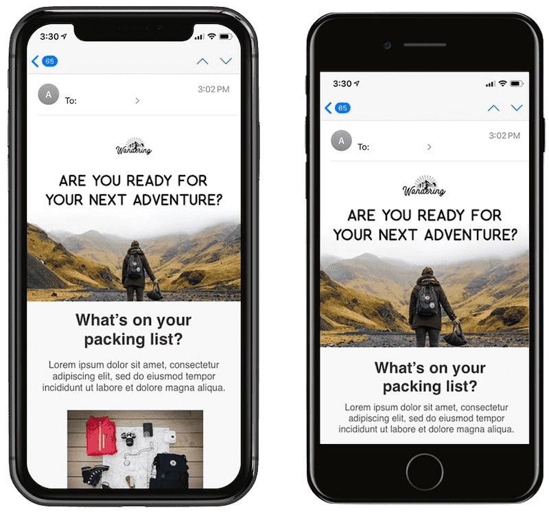
Now, it’s time to revisit our earlier example of an email layout that’s been ‘narrowed down’ and stacked for a mobile display. Here’s the design in iPhone Xs:
In this example, we’ve applied the tablescale class to HTML tables containing the text and images. Below is a snippet of code that contains two @media queries, creating two breakpoints for mobile devices:
<style type="text/css">
    /* regular CSS styles go here */
    @media only screen and (max-width: 640px) {
        /* mobile-specific CSS styles go here */
        .tablescale {
            width: 440px !important;
            margin: 0 !important;
        }
    }

    @media only screen and (max-width: 479px) {
        /* mobile-specific CSS styles go here */
        .tablescale {
            width: 100% !important;
            margin: 0 !important;
        }
    }
</style>
The tablescale class does something really interesting here. When the email is viewed on a device with a screen width of 640px or wider, it has no effect. However, when the screen width is 640px or less, it narrows down the table widths to 440px. This same action is taken at the second breakpoint at 479px, giving the table a width of 100%.
We’ve also added !important; to the mobile-specific styles to ensure they take precedence. But otherwise, it’s run-of-the-mill CSS.
You could also feature other declarations, like:
<style type="text/css">

@media only screen and (max-device-width: 640px) {
    /* mobile-specific CSS styles go here */
    .tablescale { width: 440px !important; margin: }
    .imgscale { width: 100% !important;  }
}

@media only screen and (max-device-width: 479px) {
/* mobile-specific CSS styles go here */
    .tablescale { width: 325px !important; margin: 0 !important; }
    .imgscale {
        width: 100% !important;
        height: auto !important;
        margin: auto !important;
    }
}
</style>
Assuming that the examples in this guide have made sense so far, we’re going to start looking at more advanced techniques for adapting your email for mobile devices.
🍫 Building responsive layouts
While one-column HTML email layouts are generally the way to go when optimizing your newsletter for mobile devices, there’s an elegant way to create responsive two-column layouts, without resorting to mile-long stylesheets in media queries.
While two-column layouts often allow more content to be featured above the fold on desktop email clients like Outlook, they’re a pain to read and navigate on mobile devices. Fortunately, this can be fixed with a bit of coding.
One of the golden rules of email design is ‘where possible, use HTML attributes instead of CSS’. Whereas CSS support can be fairly flaky across the gamut of email clients, attributes tend to be rock solid. For example, attributes like align=”left” and cellpadding=“10” are far more reliable than their approximate CSS equivalents, float: left; and padding: 10px;. It’s exactly these attributes we’ll be using when building our two-to-one column layout.
Let’s look at such a layout in Outlook 2007:
In the example above, we have a 640px-wide container table, with two 300px-wide tables nested inside to form columns, similar to our previous examples. These nested columns have cellpadding=”10″ applied to stop the content from pressing hard against the edges.
When coding for the web, we’d generally apply float: left; to the left-hand column, to get them sitting side-by-side. But in email, instead we can use align=”left”. As long as the container table width is more than or equal to the combined width of the two columns, both will fit nicely in this fashion.
Here’s the simplified code for the two-column layout so far:
<table width="640" border="0" cellpadding="0" cellspacing="0">
    <tr>
        <td>
        <table width="300" border="0" cellspacing="0" cellpadding="10" align="left">
            <tr>
                <td>Column Left Content</td>
            </tr>
        </table>
        <table width="300" border="0" cellspacing="0" cellpadding="20" align="right">
            <tr>
                <td><img src=”IMG_URL” width=”280”></td>
            </tr>
        </table>
        </td>
    </tr>
</table>
The rendered result:
If the container table is 640px wide, you’ll get a two-column layout. But any skinnier than this and the right column will wrap under the left column. Make it the same width as the column tables (320px) and you’ve got a flush, one-column layout that fits an iPhone display exactly, with no zooming required.
One-line media query to our HTML code:
<style type="text/css">
    @media only screen and (max-device-width: 480px) {
        .tablescale {
            width:100% !important;
            Margin: 0 !important;
        }
    }
</style>

<table width="640" border="0" cellpadding="0" cellspacing="0" class="tablescale">
The result is a responsive layout that displays two columns on desktop and web clients, then switches to one column in iPhone Mail and the default Android email client.
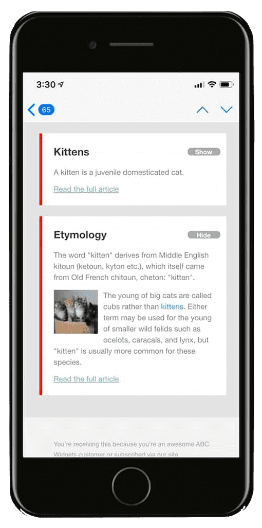
Adding Wikipedia-style progressive disclosure
On the web, many responsive sites convert luxurious long-form content into items compressed for mobile devices. This is typically by using a technique referred to as progressive disclosure. This involves hiding content behind an interactive element like a button or link, then displaying it on click or tap.
Wikipedia uses progressive disclosure, as do a lot of mobile applications.
Let’s say we have an email newsletter with multiple articles. In desktop email clients, we want a heading and text to display in each article, like so:
However on mobile clients, we only want the heading to display, alongside a show/hide button (which toggles the text). This turns the email into an interactive table of contents, dramatically shortening the message length:
To do this, we’ll firstly need to turn to our HTML code and create an article with a heading, some text, and a show/hide button. We’ll also add a couple of classes to display the show/hide buttons exclusively on mobile devices.
Here’s a simplified version of the code used for each of the articles:
<td>
    <h4><a target="_blank" href="https://yourdomain.com" class="link">First heading</a></h4>
    <a target="_blank" href="#" class="mobilehide">Hide</a> <a target="_blank" href="#" class="mobileshow">Show</a>
    <div class="article">
    <p class="bodytext">
    <img src="https://yourdomain.com/kitten.jpg" style="float: left;" >Pellentesque habitant morbi...
    </p>
    <a target="_blank" href="https://yourdomain.com">Read more...</a>
    </div>
</td>
Take note the classes mobilehide, mobileshow and article—these will be handling most of the action.
In our stylesheet, we’ll hide the show/hide button when the email displays in desktop and web email clients, by using display: none; in our stylesheet like so:
.mobileshow a, .mobilehide a {
    display: none !important;
}
To ensure that the show/hide buttons are only displayed on mobile devices, we’ll turn to our media query. Here’s the code, including the earlier .mobileshow and .mobilehidesnippet and some webkit-friendly button styling for good measure:
@media only screen and (max-device-width: 480px) {
    .mobileshow a, .mobilehide a {
        display: block !important;
        color: #fff !important;
        background-color: #aaa;
        border-radius: 20px;
        padding: 0 8px;
        text-decoration: none;
        font-weight: bold;
        font-family: "Helvetica Neue", Helvetica, sans-serif;
        font-size: 11px;
        position: absolute;
        top: 25px;
        right: 10px;
        text-align: center;
        width: 40px;
    }
    .article {
        display: none;
    }
    a.mobileshow:hover {
        visibility: hidden;
    }
    .mobileshow:hover + .article, .article:hover {
        display: inline !important;
    }
}
And, if things go well, the result is an email with show/hide buttons that toggle content on the iPhone.
Outlook and the 120 DPI issue
Outlook continues to be widely used among many businesses, and thus should not be ignored when thinking about your responsive email design. So let’s breakdown the 120 DPI issue and how we can code around it.
DPI stands for dots per inch and is a unit of measurement for screen resolutions. Standard resolution is typically set to 96 DPI. However, with newer, higher-DPI displays, this resolution is scaled to 120 DPI.
When the DPI is scaled to 120, it will affect your text size and images, while your containers maintain their original widths, thus breaking your email. Here’s an example without 120 DPI scaling:
And here’s that same example with 120 DPI scaling:
This problem occurs when Microsoft Word is used to render an email, and is most common in Outlook 2007 through 2013 versions. This scaling issue continues to be a thorn in the side of many email developers and designers as this zoomed view often stretches your images, enlarges your text, and creates an overall poor user experience.
Using our previous code examples, let’s create a truly responsive template that works both in mobile and desktop.
The first step is to enable VML or Vector Markup Language, and scaled images in the “head” of your email.
@media only screen and (max-device-width: 480px) {

/* outlook-mso specific styles*/
<!--[if mso]>
    <style type="text/css">
    body, table, td {font-family: Arial, Helvetica, sans-serif !important;}
    </style>
<![endif]-->

/* outlook scaled image solution */

<!--[if gte mso 9]>
    <xml>
        <o:OfficeDocumentSettings>
        <o:AllowPNG/>
        <o:PixelsPerInch>96</o:PixelsPerInch>
        </o:OfficeDocumentSettings>
    </xml>
<![endif]-->
The second step to fix this issue is to add inline styles to your “tables” and other tags such as the image tag, by re-identifying the width. A general rule of thumb, if you declare the width as anything other than 100% in a tag you should re-identify within a style.
Here’s the code we created for our two-column layout with the added inline-styles.
<table width="640" border="0" cellpadding="0" cellspacing="0" style=”width: 640px;”>
    <tr>
        <td>
            <table width="300" border="0" cellspacing="0" cellpadding="10" align="left" style=”width: 300px;”>
                <tr>
                    <td width="300" align="left" style=”width: 300px;”>Column Left Content</td>
                </tr>
            </table>
            <table width="300" border="0" cellspacing="0" cellpadding="20" align="right" style=”width: 300px;”>
                <tr>
                    <td width="300" align="left" style=”width: 300px;”><img src=”IMG_URL” width=”280” style=”display: inline-block; width: 280px;”></td>
                </tr>
            </table>
        </td>
    </tr>
</table>
Now that we have that new code, here’s the same rendering above with 120 DPI, now totally responsive with the new code additions:
The text and images are larger, but everything is now in proper alignment.
If you want to learn more about Outlook scaling issues, check out Courtney Fantinato’s article “Correcting Outlook DPI Scaling Issues.”
💐 Targeting devices with media queries
You may have noticed that we’ve been using two standard media queries in this guide: @media only screen and (max-device-width: 640px) { … } and @media only screen and (max-device-width: 479px) { … }. This is great for targeting Apple iPhones and other handheld devices that make up the majority of mobile email client share.
But if you or your clients want to target tablets, larger-screen Android devices, and some of the more exotic screen resolutions in the mobile ecosystem, then you’ll need both unique media queries and unique styles to match.
Fine-tuning your media queries
Let’s go back to the max-device-width: 479px rule in our earlier media query. What this tells mobile email clients (and browsers) is that below the 479px threshold, a mobile-friendly layout defined therein should be displayed. Above that, CSS styles outside of the media query should be used.
But the dimensions you can design for can be even more specific than that. For example, only targeting displays that are 320px or more in width, but smaller than, or equal to 480px. Here’s an example:
@media only screen and (min-device-width: 320px) and (max-device-width: 480px) { ... }
What a lot of folks don’t know is that media queries can be quite focused. Apart from designing around a range of widths and heights, you can also design for screen orientations (e.g. portrait and landscape) and pixel ratios (how the width of each pixel in an image compares to the width they’re displayed at).
This provides the ability to target devices with obsessive precision. Create an iPad-specific. Target devices with retina displays. While the effort that goes into adding targeted styles may often outweigh the benefits, sometimes it takes only a couple of lines of code to get an email newsletter looking edge-to-edge perfect on both your phone and favorite tablet.
Our friend Andy Clarke created a wonderful boilerplate for targeting popular devices. It’s a great starting point for designing and building email designs that aren’t limited to two views each side of 480px.
Being paranoid about Android
Despite the words stated in the previous section, there are those who are critical of focusing on creating layouts around fixed widths like 480px, commonly known in the industry as ‘breakpoints’. As Marc Drummond argues: “If you are using responsive web design techniques (and you probably should be!), then this means that using default media query device-width breakpoints is mostly pointless.” — Marc Drummond, “Responsive web design default breakpoints are dead”
Marc acknowledges that there are plenty of breakpoints that exist outside of something like Andy Clarke’s earlier boilerplate — particularly amongst Android devices. Besides, new mobile devices come out all the time, so the media query you’re using to target the top-of-the-line Android handset today may be redundant tomorrow.
Building fluid layouts with media queries
The proposed alternative is to design fluid layouts that gracefully adjust to the width of the viewport.
By using a simple media query that applies a percentage width to elements—instead of fixed widths, like 320px—it’s possible for your newsletters to feature content that has a standard desktop view, but stretches and contracts to fit below a certain viewport width. As a result, the newsletter can display optimally in a variety of settings, from larger preview planes to smaller phones like iPhone 7.
Finally, a word of advice: While it’s very easy to become fanatical about tailoring your responsive email design for specific devices, don’t lose track of the big picture.
If 85% of your mobile-toting subscribers are viewing your email in 320px x 480px viewports, don’t feel like you have to create a @media query for every device. Creating a fluid design that can scale using a combination of percentages and defined pixel widths you will be able to cover a large percentage of your subscribers.
💾 Optimizing images for mobile
While phone screen sizes have been steadily increasing over the years along with screen resolution, it can be tempting to include more and more images in your emails. But a word of caution: While images can bring an extra wow factor to your emails, images should always be thoughtfully added with accessibility and mobile load times top of mind.
In this chapter, we’ll look at some techniques that take advantage of supported CSS properties like background-image. These techniques will not only allow you to display mobile-optimized images throughout your designs, but ensure they look crisp at any width.
Using background images for better headers
Support and the use of background images have been on the rise in the last couple of years thanks in part to increased CSS support utilizing all the benefits that media queries can bring.
One benefit of the increased support is the ability to put live text on images. Another benefit is being able to substitute images when an email campaign is viewed on a mobile device by hiding the original and letting the beautiful, mobile-friendly image shine through.
Background images and live text
In the past, if you wanted to include text on an image, it was created as a single graphic. And if that image didn’t load, you were at the mercy of your alt text. Now, with greater support for background images, you can have live text and buttons along with the beautiful images.
Let’s see how this is done.
Background images in Outlook: setting up a DOCTYPE At the top of your HTML email you’ll need to declare the DOCTYPE. Doing so informs the browser that this will be an HTML document.
<!DOCTYPE html PUBLIC "-//W3C//DTD XHTML 1.0 Transitional//EN" "https://www.w3.org/TR/xhtml1/DTD/xhtml1-transitional.dtd">
Next, we’ll set up our HTML tag, declaring the language as en, which will tell screen readers that this email is written in English. If you’re writing emails in other languages, W3Schools.com has created a list of ISO language codes.
The second half of this code will be a VML or Vector Markup Language declaration, so Microsoft Outlook will allow us to create background images.
<html xmlns="https://www.w3.org/1999/xhtml" lang="en" xml:lang="en"
xmlns:v="urn:schemas-microsoft-com:vml"
xmlns:o="urn:schemas-microsoft-com:office:office">
Next, we’ll insert our 120 DPI scaling to target Outlook 2007-2013 and ensure our email scales correctly. This code is placed in the “head” tag and outside of the “style” tag.
<!--[if gte mso 9]><xml>
<o:OfficeDocumentSettings>
<o:AllowPNG/>
<o:PixelsPerInch>96</o:PixelsPerInch>
</o:OfficeDocumentSettings>
</xml><![endif]-->
The top of your email should look something like this:
<!DOCTYPE html PUBLIC "-//W3C//DTD XHTML 1.0 Transitional//EN" "https://www.w3.org/TR/xhtml1/DTD/xhtml1-transitional.dtd">
<html xmlns="https://www.w3.org/1999/xhtml" lang="en" xml:lang="en"
xmlns:v="urn:schemas-microsoft-com:vml"
xmlns:o="urn:schemas-microsoft-com:office:office">

<head>
<meta http-equiv="Content-Type" content="text/html; charset=utf-8">
<!--[if !mso]><!-->
<meta http-equiv="X-UA-Compatible" content="IE=edge">
<!--<![endif]-->
<meta name="viewport" content="width=device-width, initial-scale=1.0">
<title>Email Sample</title>

<style type="text/css">
    html { width: 100%; }

    @media only screen and (max-width: 600px) {
        /* Table styles go here */
    }

    @media only screen and (max-width: 479px) {
        /* mobile styles go here */
    }
</style>


<!--[if gte mso 9]><xml>
    <o:OfficeDocumentSettings>
    <o:AllowPNG/>
    <o:PixelsPerInch>96</o:PixelsPerInch>
    </o:OfficeDocumentSettings>
</xml><![endif]—>

</head>
Next we’ll set up the tables and background image.
Within the “td” is where we’ll add a style and input our background image, declaring the background-position, background-size, and width.
This code will give your email a solid base that will render correctly in Gmail and Apple Mail, including iPhone. But we’re not done yet, we need to make this background bulletproof for Outlook.
Background images in Outlook: bulletproof backgrounds
Stig Morten Myre developed a popular technique to create these bulletproof backgrounds, and even created a handy background image builder. The additional VML, Microsoft’s Vector Markup Language, will allow our background image to render correctly in Outlook, specifically 2007-2019.
If your image is a simple repeated pattern or isn’t required to line up in a particular way, then use the same url link for both your “td” and VML.
However, if you don’t have a repeated pattern background, it’s recommended to have two versions of your image. The first image that’s linked in your “td” should be double the size (i.e. If your email body is 600px wide, your image should be 1200px to render correctly on Retina displays like the new iPhone). The second image that’s included in your VML should be the exact size (i.e. email is 600px wide, then image is 600px wide).
Here’s how this could look: In this first example, the same url is used for both, with image size at 1200px wide.
In this comparison, a different url is used in the “td”. The image size is 1200px, the VML image url is 600px.
While both examples allow for enough room around the live text, the second example is more visually striking and will more accurately mimic the intended layout and design.
Let’s break down what’s happening here. First, we’ll create a conditional statement [if gte mso 9]. This code creates an if then statement, showing that if Microsoft Office then replace with the following code.
Next we’ll declare that this is VML, and set the style with width and height that is appropriate for your selected image. We’ll use the v:fill tag to identify what image URL will be used.
Finally, we’ll use the v:shape tag to identify the position, and, as a best practice, restate the width and height and then place our end cap to identify what code will be replaced.
Here’s what it should look like:
<!--[if gte mso 9]>
         <v:rect xmlns:v="urn:schemas-microsoft-com:vml" fill="true" stroke="false" style="width: 600px; height: 320px;">
           <v:fill type="tile" src="https://engage.sailthru.com/rs/500-BIA-880/images/Hiking600sm.jpg" color="#ffffff" />
 </v:rect>
      <v:shape style="position:absolute;width:600px; height: 320px;">
       <![endif]-->
   <div>
<!-- code we are replacing -->
</div>

<!--[if gte mso 9]>
  </v:shape>
      <![endif]-->
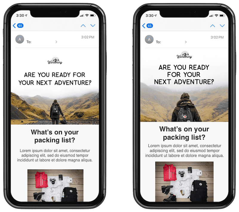
So let’s put it all together.
<table class="tablescale" width="600" align="center" bgcolor="#ffffff" cellpadding="0" cellspacing="0" border="0">
<tr>
<td width="600" style="border-collapse:collapse; mso-table-lspace:0pt; mso-table-rspace:0pt; background-image: url('https://engage.sailthru.com/rs/500-BIA-880/images/Hiking-Image.jpg'); background-repeat: no-repeat; background-position: top center; background-size: cover; width: 600px;">
<!--[if gte mso 9]>
<v:rect xmlns:v="urn:schemas-microsoft-com:vml" fill="true" stroke="false" style="width: 600px; height: 320px;">
<v:fill type="tile" src="https://engage.sailthru.com/rs/500-BIA-880/images/Hiking600sm.jpg" color="#ffffff" />
</v:rect>
<v:shape id="NameHere" style="position:absolute;width:600px; height: 320px;">
<![endif]-->
<div>
<table class="full" align="center" width="600" cellpadding="0" cellspacing="0" border="0" style="width: 600px;">
<tr>
<td class="left_header" align="center" width="600" style="font-family: Helvetica, Arial, 'sans-serif'; font-size: 35px; line-height: 40px; color:#191919; padding-left: 35px; padding-right: 35px; padding-top: 30px; padding-bottom: 200px; font-weight: 500; width: 600px; ">
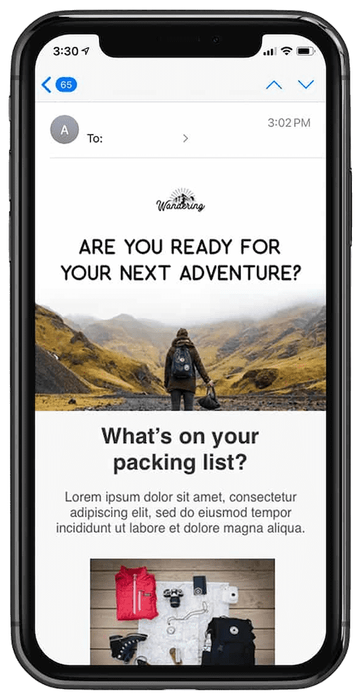
<strong>Are you ready for your next adventure?</strong>
</td>
</tr>
</table>
</div>
<!--[if gte mso 9]>
</v:shape>
<![endif]-->
</td>
</tr>
</table>
It’s generally recommended that images be resized to fit within a viewport of mobile devices. But there are special occasions when your design doesn’t allow this, resulting in a small image with illegible text.
Using unique images for mobile devices
If using a background image with live text (as seen in the example above) is not an option, you can create a unique image specifically for mobile devices. This can be accomplished by surrounding the image in a table cell or “div”, then creating a media query that hides the original and shows another header image as a background image instead:
@media only screen and (max-device-width: 479px) {
    .headerimg {
        background-image: url(https://yourdomain.com/images/header-325.png);
        width: 100% !important;
        height: 115px !important;
    }
    .imgheader {
        display: none;
    }
}
<table width="100%" border="0" cellspacing="0" cellpadding="0">
    <tr>
        <td class="headercell">
            <img class=”imgheader” src="https://yourdomain.com/images/header.png" border="0" width="600" />
        </td>
    </tr>
</table>
Here’s how things look before and after the header images have been swapped out:
An advantage to using this technique is that you can shorten the length of emails by providing significantly shorter images. Or you can restyle your images and text to enhance the mobile experience. When it comes to mobile email, the shorter, the better.
Resizing images for fluid layouts
The issue with the background image swap method above is that it’s really only effective with static-width email designs.
These days, mobile devices can come in all sorts of shapes and sizes, therefore making fluid email layouts a popular option.
While the obvious solution seems to be to set background-size: 100% in the earlier media query, as Elliot Jay Stocks points out, the better option is to use background-size: cover:
@media only screen and (max-width: 600px) {
    .imgheader {
        width: 100% !important;
    }
}
@media only screen and (max-width: 479px) {
    .headerimg {
        background-image: url(https://engage.sailthru.com/rs/500-BIA-880/images/hero_img_mobile.jpg);
        width: 100% !important;
        height: 300px !important;
        background-position: center !important;
        background-repeat: no-repeat !important;
    }
    .imgheader {
        display: none;
    }
}
Serving high-res images for Retina displays
Our final tip is in regards to getting images to display as sharply as possible on Apple’s Retina displays. This is one that we’ve covered before, but given that these displays aren’t going away anytime soon, it’s worth a recap.
The trick is to create key images at twice the size you actually plan on displaying them, thus making the image look super crisp on iPhone 11 and iPad displays. For example, using our earlier background image hack, we’d create a header image that was really 600px x 300px (e.g. https://image.url600@2x.jpg), but then shrink it down for mobile screens.
Here’s how the media query would look:
@media only screen and (max-width: 600px) {
    .imgheader {
        width: 100% !important;
    }
}

@media only screen and (max-width: 479px) {
    .headerimg {
        background-image: url(https://image.url200@2x.jpg);
        width: 100% !important;
        height: 150px !important;
        background-position: center !important;
        background-repeat: no-repeat !important;
    }
    .imgheader {
        display: none;
    }
}
If you specifically want to target Retina displays with a special stylesheet, you can use this CSS declaration instead:
@media all and (min-device-pixel-ratio : 1.5) { ... }
While doubling the size of your images will produce sharp images for larger displays (i.e. iPads and tablets), they can also weigh your emails down, creating slow load times and an overall poor experience for your subscribers.
You can help prevent slow load times with the Save for web options when you export your images from Photoshop or Sketch. You can also utilize an image compressor like TinyPng. For more information on using retina images, we recommend reading this post by Litmus.
👓 Optimizing your subscribe forms
Optimizing your email campaigns for mobile isn’t just limited to making sure your newsletter can be read on small screens. After all, what’s the point of sending mobile-optimized campaigns if mobile users can’t subscribe to your lists in the first place?
The good news is that mobile devices like iPhone and Android generally do a good job of making forms at least remotely usable these days. However, there are a couple of things designers and coders can do to make them as easy to use as possible. The obvious benefit to optimizing your forms is that they require less time and effort to fill in on a mobile device. To you, this means higher completion rates and more subscribers.
We’ll cover a couple of pointers, and feature a simple example you can use as a starting point for your own subscribe forms.
-
Top-aligned labels—A common issue when using forms on a mobile device is having labels that reside out of sight when a form field is selected in a browser. At the initial zoom level, a left-aligned label like Enter your email address may be visible, but as soon as you start entering text, the viewport zooms in and the label is flung out of sight. The solution is to either use a top-aligned label, or add the form label as a text-field value. The latter requires less vertical real estate, but can be a little annoying if the field you’ve just started filling in was initially hidden by the phone’s Form Assistant or keyboard.
-
Use input type=”email”—If you use input type=”email” on the email address form field, a special keyboard will display in iOS devices, featuring commonly used characters like @.
-
Narrow down your forms—Use fluid layouts for mobile devices, as you can’t predict the viewport’s dimensions or orientation is a best practice. Simply making a text field’s width 80% of the viewport width can massively improve the appearance and usability of your subscribe forms.
-
Be mindful of multi-option fields—While on the subject of narrow layouts, it’s prudent to force all content to flow in a single column—particularly checkboxes. Often drop-down lists are a better option over radio buttons and reduce the amount of scrolling required to navigate the form. After you’ve created a form, be sure to test it, then have your co-workers test it on their phones to ensure your form is thumb-friendly.
-
Take a stand on scale—Finally, a lot of these tips here haven’t been specific to forms, but more like web design in general. Included is the idea of setting the initial scale or zoom on a mobile device using a viewport meta tag, especially when building standalone forms. When applied, they can prevent the user accidentally zooming in unnecessarily and losing sight of most of the form. Here’s what a typical viewport meta tag looks like in the head of an HTML page: <meta name = “viewport” content = “width = device-width, user-scalable = no” />. For a couple of variants on this, check out Apple’s viewport meta tag documentation.
Creating mobile-friendly plain-text email
Not wanting to limit our advice to HTML email design, we wanted to add some pointers for optimizing plain-text campaigns.
When it comes to formatting plain-text emails, there are two camps: those who add a line break every 60-65 characters to their message, and those who don’t. Both have pros and cons, depending on which email client your message is viewed in.
60-65 character limit works best in desktop and webmail clients. This is because there’s effectively no limit to how wide paragraphs of text can run in most reading windows or preview panes. Paragraphs of text can become very much unreadable after 60 characters or so. Traversing from the end of one long line to the beginning of another is just too much visual work for effective scanning.
However, on mobile devices, things are very different. In Apple Mail on iPhone, a 65-character line break combined with wrapping text results in a very jagged message. It’s arguably worse than reading an infinitely long line of text.
If you’re sending HTML email with a plain-text version containing line breaks, most mobile email clients won’t ever have to fall back to viewing it. So it isn’t quite time to undo the app’s handiwork when it automatically creates a nicely formatted text-version of your HTML campaign. However, if you’re sending plain-text campaigns only, it’s worth having a look at your email client usage reports when deciding which way to go. If you have plenty of subscribers reading their email on a mobile device, it may not be an appealing idea to add your own line breaks.
💡 Case study: Twitter
Let’s put some of these techniques into practice by applying them to a real-world email. Not just any email, but one that’s sent to millions of people every day.
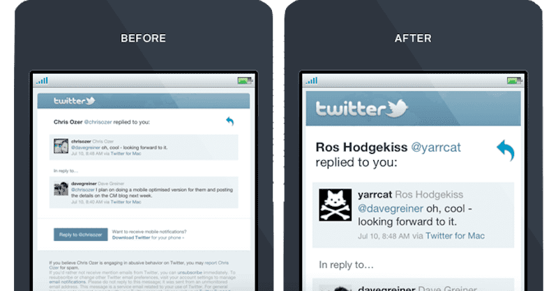
In the not-so-distant past, Twitter’s email notifications were subpar on mobile devices. The problem was this: a combination of tiny text and wide layouts pushing out the zoom made them nearly unreadable on small screens.
In just five minutes, we applied a simple fix that made a world of difference to the usability and readability of their notifications. And it may potentially help you significantly improve how your email campaigns display on mobile devices, too.
In this case study, we’ll show you how we took a humble email notification and turned it into something tweet-worthy when viewed in iPhone or Android Mail, or any mobile email client that supports media queries.
Taming the tiny text First of all, we wanted to approach the most apparent issue with Twitter’s notifications: tiny text. The reason why the text looks so small is because the 710px-wide layout forces the email client on mobile devices to zoom out significantly to view the entire width of the message. Let’s address this with a media query targeting small displays:
@media only screen and (max-width: 479px) { ... }
If you’ve read much on responsive email design, you may know that you add these declarations to your “style” tags. The stylesheets within can only be interpreted by HTML email clients that meet the @media-only screen and (max-width: 479px) criteria. So let’s put it to use on adapting the layout here.
First up, there are two tables surrounding the body of the email message:
<table cellspacing="0" cellpadding="0" border="0" width="100%">
<tr>
    <td style="background-color:#e9eff2; padding: 30px 15px 0;">
        <table cellspacing="0" cellpadding="0" border="0" align="center" width="710" style="font-family: 'Helvetica Neue', Helvetica, Arial, sans-serif; font-size: 16px; color: #333;">
We’re going to bring them down to size by adding classes wrappertable, wrappercell and structure:
<table cellspacing="0" cellpadding="0" border="0" width="100%" class="wrappertable">
    <tbody>
        <tr>
                <td style="background-color:#e9eff2; padding:30px 15px 0" class="wrappercell">
                <table cellspacing="0" cellpadding="0" border="0" align="center" width="710" style="font-family:'Helvetica Neue', Helvetica, Arial, sans-serif;font-size:16px;color:#333" class="structure">
Now that we have something to target, let’s get to work with these classes in our media query:
@media only screen and (max-device-width: 479px) {
    body { width: 320px !important; }
    .wrappertable { width: 320px !important; }
    .structure { width: 300px !important; }
}
The widths used above are significant, as on the iPhone in particular, the display width is 320px in portrait orientation. By narrowing the email layout to 320px, it will be viewed at 100% zoom by default, which means that not only will the whole design be visible, but text and images will look crisp, too.
Putting a harness on the header image
The above technique would be all well and good if it wasn’t for that infernally wide ‘Twitter’ header image. So we’ll do something crafty and split the header image into three images. Sections which don’t need to be displayed in our new, narrow layout can simply be hidden. Here’s the original code:
<img alt="Twitter" height="52" src="https://a0.twimg.com/a/1335832060/images/email/email_header_710.png" style="border: 0; display: block;" width="710" />
And here it is, with the header image in three pieces:
<img alt="Twitter" height="52" src="https://yourdomain.com/logo-left.png" style="border:0;" width="41" class="logo"><img alt="Twitter" height="52" src="https://yourdomain.com/logo.png" style="border:0;" width="320"><img alt="Twitter" height="52" src="https://yourdomain.com/logo-right.png" style="border:0;" width="336" class="logo">
You may have noticed the class logo on https://yourdomain.com/logo-left.png and https://yourdomain.com/logo-right.png. Hiding these bits is pretty straightforward—simply add the following to our existing media query:
.logo { display: none !important; }
At last, we’ve got a header image and layout that’s trimmed down to size on mobile screens.
Another way to get the same result without slicing images is to create a table row or “tr” with a background color and then place your logo in the “td”.
Here’s what that code would look like:
<table align="center" width="600" bgcolor="#3BC5F5" cellpadding="0" cellspacing="0" border="0" style="border-collapse:collapse; mso-table-lspace:0pt; mso-table-rspace:0pt; width: 600px;">
    <tr>
        <td width="600" align="left" valign="bottom" class="logo" style="margin: 0; padding-bottom: 20px; padding-top: 20px; padding-left: 30px; font-size:18px; color:#ffffff; font-family: Helvetica, Arial, sans-serif; width: 600px; ">
            <a href="url_twitter" target="_blank">
            <img class="logo" src="twitter_img_logo.png" width="165" alt="Twitter" border="0" style="display: inline-block; color: #ffffff; width: 165px; color: #ffffff; font-size: 20px; line-height: 26px;" />
            </a>
        </td>
    </tr>
</table>
Now, on top of the above re-factors, we added some extra padding around elements and adjusted font sizes to taste.
Licenses & certifications
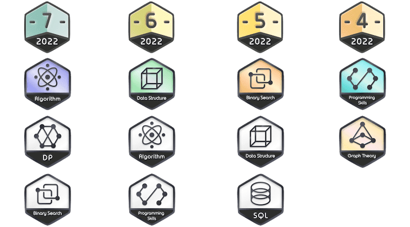
- 🏆 LeetCode Global TOP 200 (TypeScript: Certificate, Sources: TypeScript).
- 🏆 Golden Award for the Year of the Tiger Challenge (TypeScript: Certificate, Sources: Codility).
- 2022 July LeetCode Challenge (2022-07-31).
- 2022 June LeetCode Challenge (2022-06-30).
- 2022 May LeetCode Challenge (2022-05-31).
- 2022 Apr LeetCode Challenge (2022-04-30).
- LeetCode Dynamic Programming (2022-05-07).
- Graph Theory (2022-04-30).
- SQL (2022-04-26).
- Algorithm I (2022-04-30), Algorithm II (2022-05-21).
- Data Structure I (2022-04-30), Data Structure II (2022-05-21).
- Binary Search I (2022-04-28), Binary Search II (2022-05-18).
- Programming Skills I (2022-04-28), Programming Skills II (2022-05-18).
- LinkedIn Skill Asessment (Front-End): Front-end Development, Angular, React, Javascript, HTML, CSS, jQuery.
- LinkedIn Skill Asessment (Back-End): Node.js, Java, Spring Framework, Scala, C#, .NET Framework, Unity, Python (Programming Language), Django, PHP, C (Programming Language).
- LinkedIn Skill Asessment (Databases): MongoDB, NoSQL, Transact-SQL (T-SQL), MySQL.
- LinkedIn Skill Asessment (Infra/DevOps): Bash, Git, Amazon Web Services (AWS), AWS Lambda, Google Cloud Platform (GCP), Microsoft Azure, Hadoop, IT Operations.
Contacts
I have a clear focus on time-to-market and don't prioritize technical debt. And I took part in the Pre-Sale/RFX activity as a System Architect, assessment efforts for Mobile (iOS-Swift, Android-Kotlin), Frontend (React-TypeScript) and Backend (NodeJS-.NET-PHP-Kafka-SQL-NoSQL). And I also formed the work of Pre-Sale as a CTO from Opportunity to Proposal via knowledge transfer to Successful Delivery.
🛩️ #startups #management #cto #swift #typescript #database
📧 Email: sergey.leschev@gmail.com
👋 LinkedIn: https://linkedin.com/in/sergeyleschev
👋 Twitter: https://twitter.com/sergeyleschev
👋 Github: https://github.com/sergeyleschev
🌎 Website: https://sergeyleschev.github.io
🌎 DEV Community: https://dev.to/sergeyleschev
🌎 Reddit: https://reddit.com/user/sergeyleschev
🌎 Quora: https://quora.com/sergey-leschev
🌎 Medium: https://medium.com/@sergeyleschev
🖨️ PDF: Download
ALT: SIARHEI LIASHCHOU